
A patient and gynecologist communication app
Oasis
A patient and gynecologist communication app

Overview
Oasis is a conceptual app designed to improve communication between patients and gynecologists. A personal oasis where women can feel more comfortable about annual wellness checkups and personal care.
Project Type
Solo - Case Study
Timeline
2 weeks
Role
UX Researcher
UX Designer
Design Strategist
Tools
Figma
InVision
Otter.ai
A Temperature Check on Women’s Wellness Checkups
Problem
For women, the topic of gynecology and annual pap smears is one that is often treated as taboo. A pelvic exam is one of the most anxiety-provoking medical procedures. However, fear surrounding gynecologic visits can interfere with preventative health screening compliance resulting in significant health consequences.
Solution
I designed a mobile app that improves communication between patients and their gynecologists, allowing patients to feel more comfortable and supported throughout the process. Oasis facilitates healthy communication before, during, and after visits to the gynecologist, which helps reduce the anxiety associated with wellness checkups.
Women’s Concerns Rise to the Surface in Research
54.8% of women felt anxious or worried in an outpatient gynecology setting
(Midwifery, 2009)
Not anxious about gender

Anxious about gender
Nearly 2/3 of women expressed some degree of anxiety about the gender of their gynecologist
Nearly 2/3 of women expressed some degree of anxiety about the gender of their gynecologist
(Verywell Health, 2021)
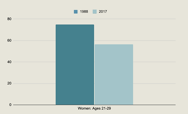
75% of women got an annual pelvic exam in 1988 and that rate fell to 56.5% by 2017
(CDC, 2019)
I started to get curious about how to tackle this issue with a digital solution and aimed to delve deeper into the problem space, so I created a research plan to interview women.
Primary Research
My research objective was to gather qualitative data to better understand the experiences of women with annual wellness checkups and why some women avoid visiting a gynecologist altogether. I sought to uncover the pain points that explained why pelvic exams are one of the most anxiety-provoking medical procedures. Furthermore, I wanted to understand women's values when selecting a gynecologist.
I conducted 4 interviews (decontextualized) with participants in-person and via Zoom. The interviews were recorded via transcription and audio with the participants’ consent.
Participant Criteria
-
Female
-
Adult (18+)
-
Based in the United States
-
Willing to discuss their reproductive health and history
-
Medical insurance and/or financial means to visit a gynecologist
-
Visited a gynecologist before or plan to visit one
Questions that Uncovered Important Information
Since this is a sensitive topic that involves vulnerability, my main priority was to make my interviewees feel comfortable at all times. I carefully crafted questions that were relevant, open-ended, and non-leading. More importantly, I reassured the participants that they didn’t have to answer any questions that they weren’t comfortable answering. Some of the questions were:
-
Can you explain the last time you went to a gynecologist and how it made you feel?
-
Has anyone ever formally explained to you what a typical gynecologist visit or wellness checkup should entail?
-
Tell me about a memorable gynecology visit that you had. Why?
-
What are the qualities that make an ideal gynecologist for you? Why?
Summary of Findings
My hypothesis, "I believe that women dread going to a gynecologist because they are afraid of experiencing physical discomfort/pain during their exam," was not validated in this research.
Only 1 out of my 4 interviewees mentioned avoiding a gynecologist due to past discomfort/pain. However, all of my interviewees expressed that they wanted a gynecologist who was personable and willing to address all their questions and concerns in order to make them feel more comfortable about getting a wellness checkup.
Giving My Interviewees a Voice
After conducting my interviews, I sorted all the responses by pain points, motivations, and behaviors using an affinity map and uncovered important themes and insights.
Gynecologist’s Gender
Women prefer female gynecologists and feel more comfortable with them.
Negative Experiences
Most women have had a negative experience at a gynecologist’s office or have heard of their peers having a negative experience.
Personality & Empathy Are Important
Women want a gynecologist who is friendly, personable, and makes them feel comfortable.
Communication During & After Visit
Women want a gynecologist who takes the time to explain the process and is open to hearing and answering their questions/concerns without judgment. They also want the gynecologist to personally follow up with them to explain results and/or check-in after their visit.
These discussions revealed the problem that I needed to solve. The most compelling theme to tackle using a digital solution was Communication During & After Visit.
The Design Challenge
How might we improve communication between patients and their gynecologists so patients feel more comfortable and supported?
Meet Emily

User Story & Epic
Considering Emily’s pain points, motivations, and behaviors, the user story and epic that best addressed my design challenge were:
Epic: Share/Update Preferences
User story: As a patient, I want to receive a reminder to update my preferences so that my doctor and their staff can provide a more personalized experience at my next visit.
Task Flow
Next, I worked on developing a task flow based on the chosen user story/epic. This process involved revising my task flow a few times to make sure I was defining the most a seamless experience for users.

Design Exploration
I began sketching concepts for screens, components, and features for the Home, Inbox, Reminder Message, and Preferences screens. From there, I selected solution sketches to move forward with as a foundation for my digital wireframes.
Usability Testing & Revisions
I transformed the sketches into grayscale wireframes and prototyped them. Using simple interactions, I created a prototype to test with potential users. I conducted usability testing with 5 participants over Zoom and Facetime; all participants were women older than 18 since they are the target consumer for this app.
Overall, most of the participants understood how to complete each task and commented that the flow was easy to understand. However, this experience taught me that testing with wireframes that are a bit more developed and include copy and all icons, rather than empty boxes, would have been more effective.
I organized all the feedback into a prioritization matrix after each round to help me prioritize the most impactful revisions that would improve the user experience. Below are some of the key revisions that I implemented based on the feedback.
Initial

Feedback
-
Since the screen had empty components, it was hard for participants to understand that the app was more than just a scheduling app.
Initial

Feedback
-
The screen lacked copy and, generally, a better indication of where the user was.
-
Since we were testing without images, the users weren’t sure who the people from the messages were.
Initial

Feedback
-
Since we were testing without images, the users weren’t sure who Kayla was.
-
A few users commented that the font was small and a bit difficult to read.
-
Users had to read all the messages to infer where the hyperlink was located to navigate to Preferences.
Initial

Feedback
-
The majority of users commented that some of the buttons on the Preferences screen were confusing. For example, users weren’t sure what “Tools” or “Experience Level” meant.
Revised

Solution
-
Added icons and copy to the buttons to make it clear to users that the app has other functions, and it’s a lot more than just an app where you can schedule appointments.
Revised

Solution
-
Added a title so users know what screen they’re on.
-
Added a bar under “Inbox” so users understand that they’re looking at their inbox rather than the outbox.
-
Added the title of each contact, so users understood who they were communicating with.
-
Added a circle indicator so users know when a contact is online.
-
Added a preview of each message.
Revised

Solution
-
Added the title of the contact.
-
Added a circle indicator to show that the contact is currently online.
-
Made the font size of the messages bigger so it’s easier for users to read.
-
Added a hyperlink to “tap here” so users knew where to click.
-
Made it clear to the user that by tapping, they’d be taken to their preferences.
Revised

Solution
-
Revised the titles of three of the buttons since those were the ones that caused confusion among users.
-
Added a “back” button to give the user control & freedom to navigate back to the previous screen.
The Remedy
High-Fidelity Wireframes & Prototype
While the two-week design sprint ended here, I decided to revisit this design a couple of months later and iterate further since I was very compelled by the problem space. My goal was to design a few more screens and bring the app to life via a high-fidelity prototype to better understand how users would interact with the app and make further improvements to the experience.
I created a simple, yet memorable name for the app - Oasis. An oasis is a fertile spot in a desert where water is found. Metaphorically, I’d like this app to represent an oasis; a means for users to have a more positive relationship with gynecologists and wellness checkups.
Moreover, I carefully selected illustrations and colors for the UI that yielded a peaceful and calm environment. According to psychology research, blue calls to mind feelings of calmness or serenity. It is often described as peaceful, tranquil, secure, and orderly. Similarly, green symbolizes harmony, tranquility, peace.
Welcome to Your Personal Oasis
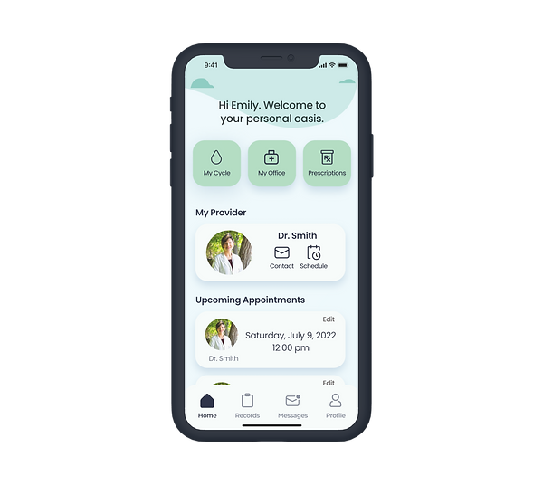
Health Aide
Keep a record of your menstrual cycle and prescriptions along with your gynecologist/OBGYN.
View your upcoming appointments and make edits if necessary.


Communicate with your gynecologist/OBGYN and their staff in real-time.
Better Communication


Your Space, Your Choices
Update your preferences so your doctor and their staff can provide you with the most comfortable experience for YOU before, during, and after your appointment.

Future-thinking
I plan to recruit another 5 users to test the high-fidelity prototype. A second round of testing would allow me to validate if my revisions were effective or if further edits are necessary before developing the app further.
Since this app would hold sensitive information for women, ensuring this virtual space was safe and secure would be a top priority. With the exception of the user's provider, no other party would have access to the user's information or records.
Key Learnings
Attention to Detail
This experience taught me to focus more on refining the details of screens (e.g. copy, images), which helps to provide a user with more context when conducting a usability test. Confusion can lead to a missed opportunity because users may decide to abandon the product altogether.
A Persona’s Value
During each step of the design process, it’s important to refer back to the user persona to remember who you’re designing for and stay focused on solving their pain points.